
I started working as an associate packaging designer for Mattel's Hot Wheels™ team starting in late 2024. My first batch of projects were the Hot Wheels™ Red Line Club packages for 2025. The finished products were supervised and art directed by lead packaging designer Matt Gabe.


My first design for Red Line Club was the second release of the Dodge Tradesman Van in root beer color with tiki style graphics. The idea was to incorporate tiki motifs into the box art. The jumping-off point for me was the graphic logo, which was 'tiki-fied' from the logo on the 1st release of the toy. Several different versions were made, and were later matched on to different rough sketches of the packaging box.


A repeated tiki-style pattern was created, inspired by the graphics on the toy itself. Elements such as the Tradesman van, red-line wheels and the Hot Wheels logo were included.


The final design was heavily based on rough v3, with pattern elements from v1 incorporated.
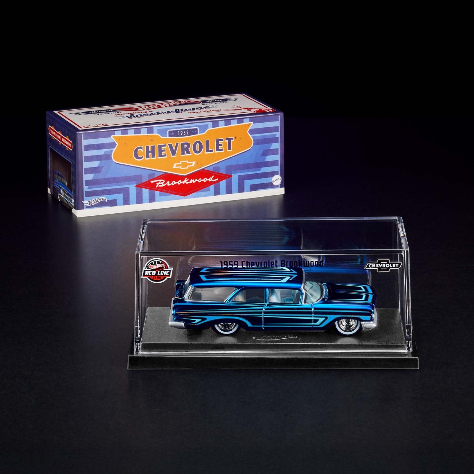

The Chevrolet Brookwood is the 2nd 2025 RLC design I worked on. Initially, as the car is indended as a pristine restomod of a 1960s classic built in Detroit, the packaging concept was to create something that while harckoning back to the good-ol' automotive golden age, feels contemporary and modern, which proved to be a bit of a challenge.

My first design concept focuses on the retro-modernist aspect, incorporating motifs from the famous art deco architecture of Detroit (such as the Guardian Building and the music hall) to create this mosaic on the top of the slip cover.
The second design, features the Ambassador Bridge, another famous Detroit landmark, with the name of the car as well as the chevy logo intergrated onto the architecture.

Design three pay homage to the checker factory where many GM models rolled off the assembly line back in the 60s. The now defunct factory wall peels off to present the shiny paintjob of the Chevy Brookwood (and an easter egg of lake Michigan).
The last one embraces the gritty street scenes of modern detroit, simillar to the famous Gymkhana shorts. In the backround is GM's Renaissance Center.

The design team later decided to pivot the packaging concept towards an homage to the classic Detroit modshops (Watson's Custom Kars, Alexandar Bro's Custom Shop, etc.), with the top side becoming a business card for the custom shop.

I did an illustration for the side panel of the slip cover box, adds a small play value to the box by transforming it into a diecast-scale mini custom shop.


The idea for this particular package is to go full 90s, and to bring out the track-focused characteristics of the M3 LTW. As per BMW's request we couldn't use the BMW logo or the M badge on the packaging, I resorted into using more subtle ways, including the M stripes, the checkered flags (while also an homage to LTW's unique branding), incorporating the advertising taglines as well as using BMW's official Helvetica font family for all the text on the box.


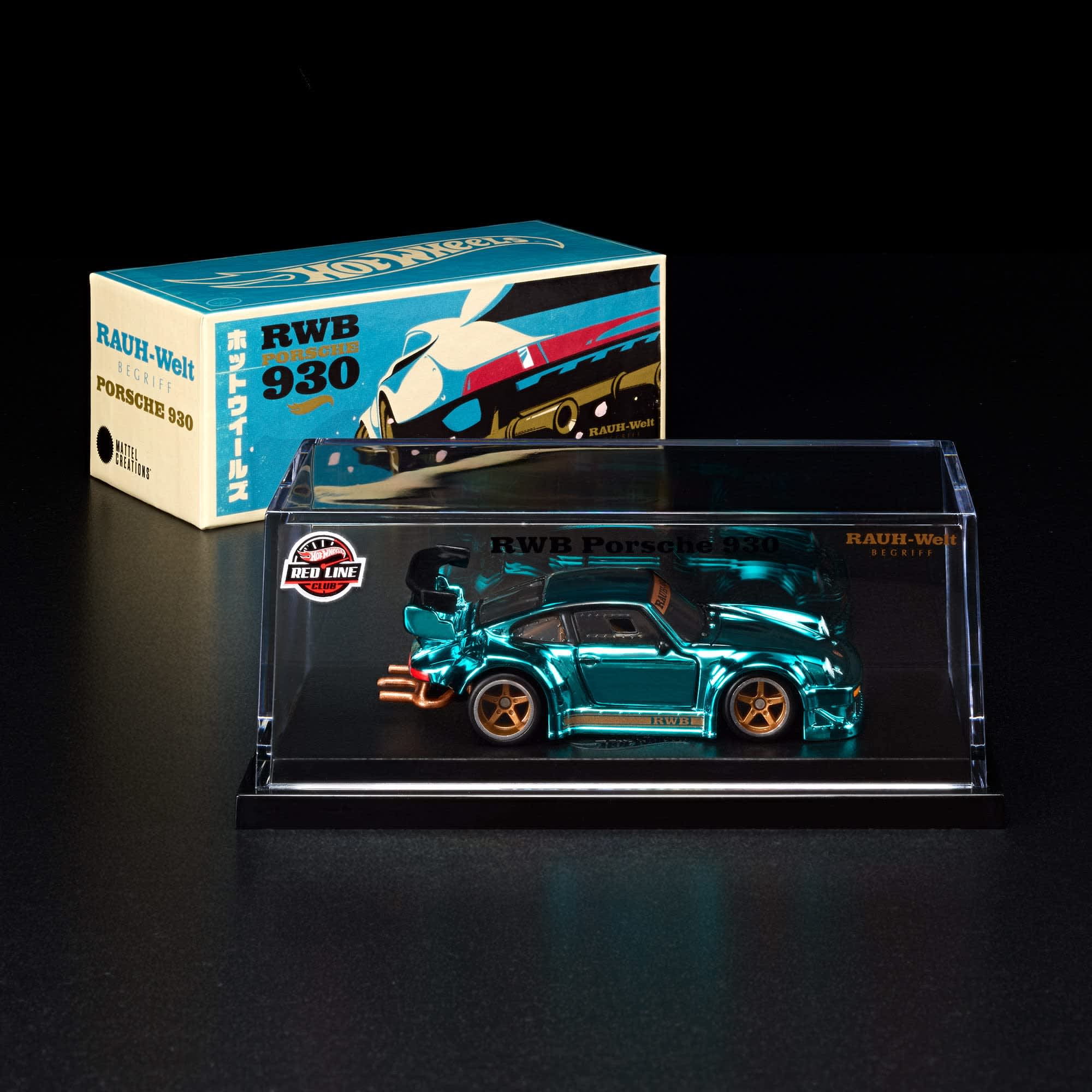
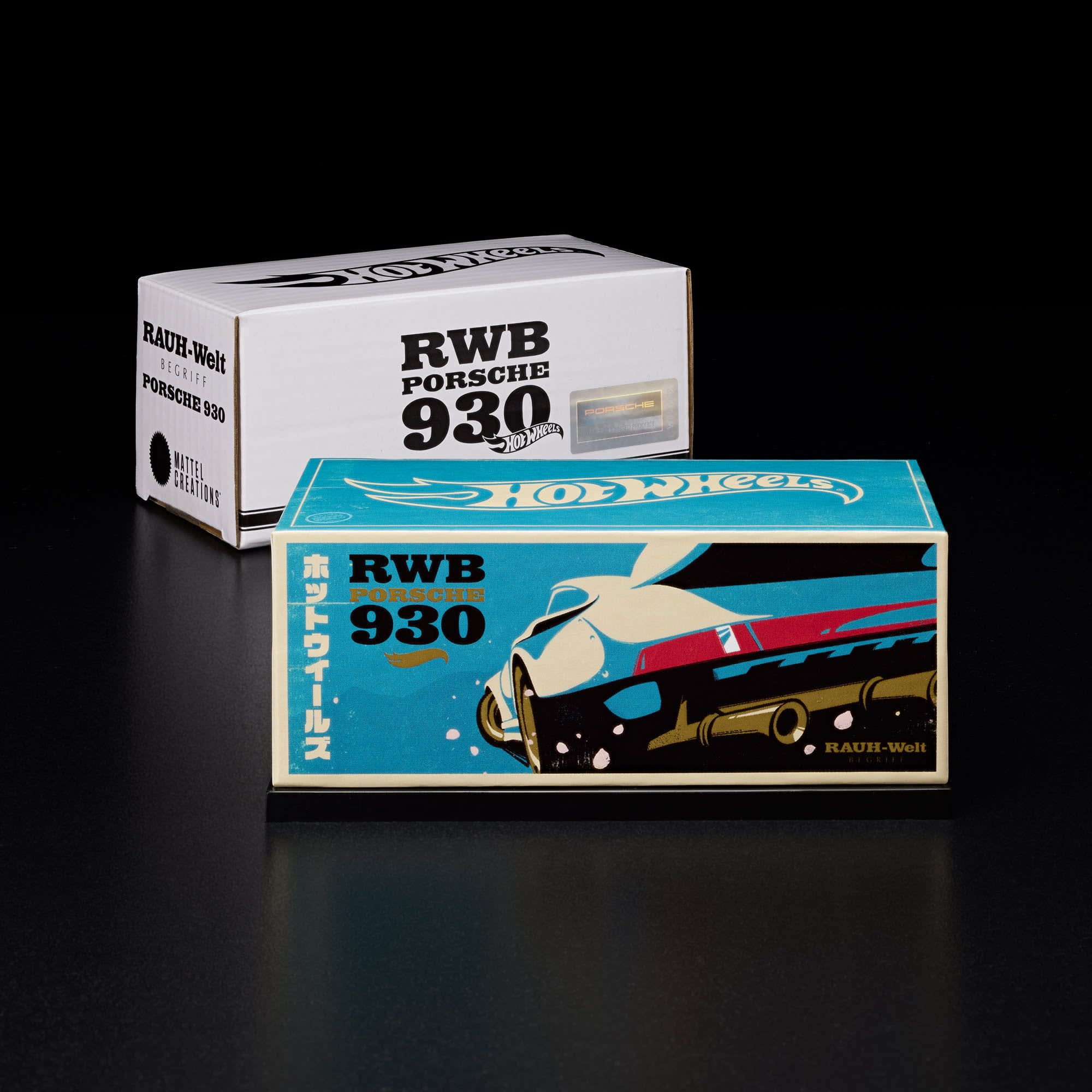
I consider the RWB 930 slip cover as my first 'major project' at Mattel, the opportunity to work on Hot Wheels' vastly popular diecast of the Akira Nakai Porsche is nothing but exciting, and my goal for this design is to bring it back to the roots of the early days of Nakai-san's works and the Rough-World racing team. The designs delibrately mimicked the old Japanese pamphlets, magazines and woodprints. One particular version even featured Japanese quotes of an early magazine interview of Akira Nakai.

The woodprint idea ended up being the favorite. The color schemes of the car matched the style of traditional Japanese prints perfectly, so it was naturally a match.

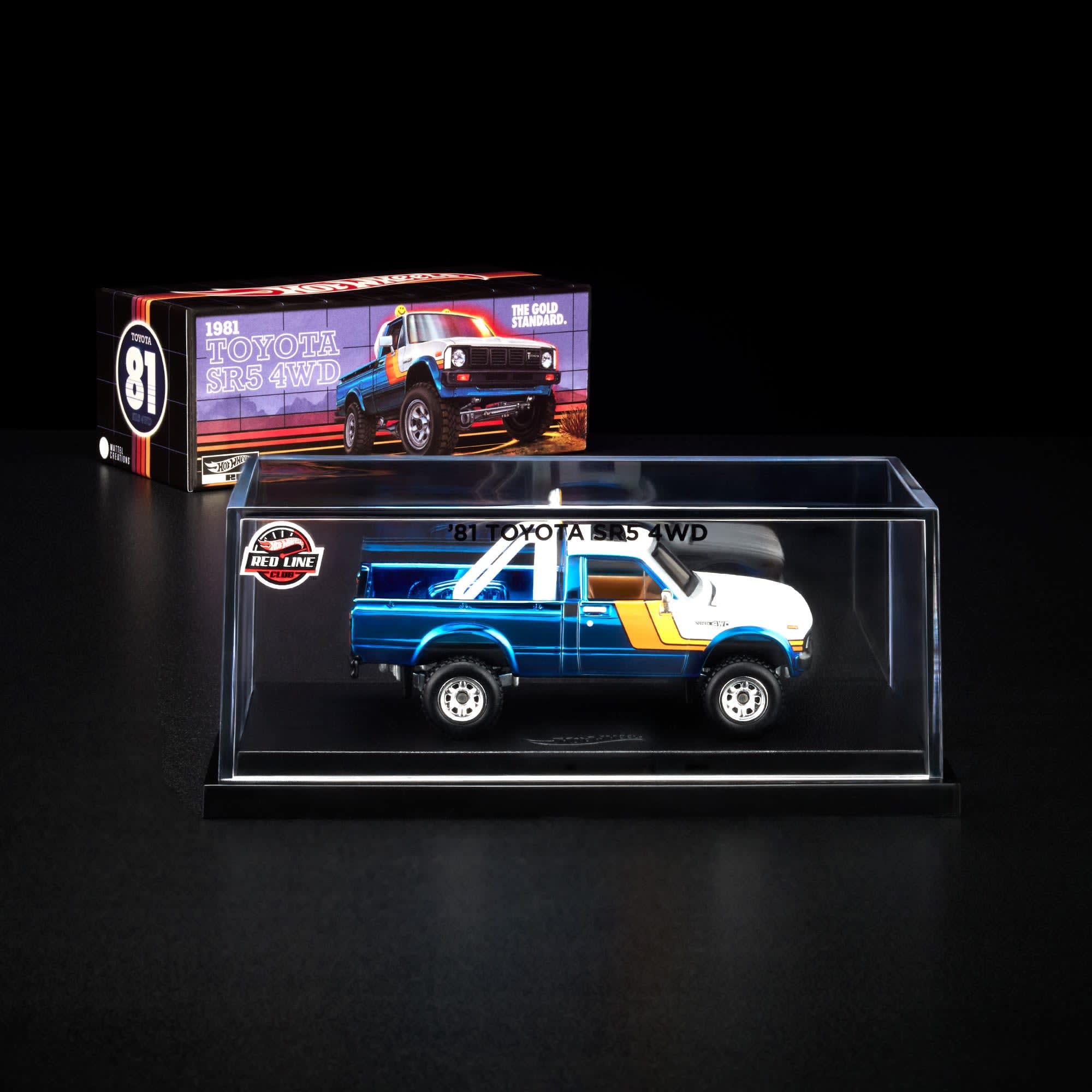

The design team wanted something retro, something old-school for the packaging of the 1980s Toyota truck. I came up with the idea to make the box a toy box from the 80s. The grids on the final design is both inspired by old toy packging art (ie. the Transformers toyline), and the 80s Toyota ad campaign (even down to the taglines, which were done in the same font as those old adverts). Toyota didn't want us to feature any logo or wordmark, so I went for a few fonts that look and feel distinctly Toyota while not being the actual modern Toyota font.


The design team wanted something retro, something old-school for the packaging of the 1980s Toyota truck. I came up with the idea to make the box a toy box from the 80s. The grids on the final design is both inspired by old toy packging art (ie. the Transformers toyline), and the 80s Toyota ad campaign (even down to the taglines, which were done in the same font as those old adverts). Toyota didn't want us to feature any logo or wordmark, so I went for a few fonts that look and feel distinctly Toyota while not being the actual modern Toyota font.